Posts

Showing posts from October, 2021

About me

Image
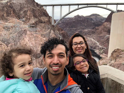
    Hello there my name is Efren Lopez, I am 28 years young. I have a beautiful wife and three kids. I love to travel to National landmarks with my family. My favorite trip has been to the Grand Canyon and during that visit we also checked out, Meteor Crater and the Hoover Dam. Taking trips to these landmarks motivated me to one day be a part of the team who work to protect and maintain the landmarks. During these trips I handled so many maps that I could have became a tour guide. That when I found out I like maps, and historical land marks. I want to be able to help protect lands and wildlife, and with the help of GIS I can open the door to many more opportunities. This is the reason I joined to help me land a job in the local government at the parks and natural resources department. I have to start small, I want to work for the National Park Service. I hope to learn the basics and proper techniques of GIS upon my completion. I recently graduated with my Associates of Arts and got ac

M7: Google Earth and KML files

Image
This week we worked on converting ArcGIS layers to a special file type called KML, giving us access to manipulate it and make a 3D tour of south Florida. The map covers the population density and the surface water of south Florida. Converting the files to a different format was simple, I had to run a tool in ArcGIS called Layer to KML. From there windows recognized the file type and associated it to Google Earth, all I had to do was double click and the file then it automatically opened in Google Earth, Awesome! Google earth interface pales in comparison compared to ArcGIS Pro. I am used to using the ArcGIS Pro application and have familiarized my self with a few keyboard shortcuts that I found my self trying to use them in Google Earth. Getting used to manipulating the map on Google Earth was difficult at first and my computer is not that powerful and because of that the animation where glitchy, especially when recording the video. It made me think I was doing something wrong, I rev

M6: Isarithmic Mapping

Image
This week we learned about Isarithmic Mapping, Methods of Interpolation, and Flow mapping. I did not understand what an Isarithmic map was, once we started working on the project it started to make sense to me. This week’s lab I made an Isarithmic Map and I learned how precipitation data is derived from PRISM which is an analytical model that estimates monthly and annual precipitation and temperature, as well as other climatic parameters. I worked with a continuous tone and a hypsometric tint. Adding the hypsometric tint was puzzling, but after researching more about what exactly the Int analyst tool did I was good to go. The Int tool converts each cell value of a raster to an integer by truncation. After I added the contour lines, I realized that all the contour lines were one color and no matter what color I chose it did not look right to me, I was aiming for each contour line to be a darker shade of its hypsometric tint. I accomplished this by changing the color of the contour l

M5: Choropleth Mapping

Image
This week we worked on making a choropleth map of Europe and a proportional symbol representing wine consumption. At first, this lab was confusing since I do not know exactly where each country is located, and with some names of the countries being a different language threw me off. I can say now I am more familiar with Europe than when I started. For the color of this map I choose a light yellow that sequentially moves to green then to dark green. I choose green because it embodies land and money. I went with the a realistic basemap that had a nice shade of blue to represent the water. I could not use illustrator for some reason it was choppy and slow to respond and kept crashing on me. I wanted to outline the countries for the inset map then make a line form the outline to the inset map. Instead I made a transparent dashed line of the area that is needed a close view to the inset map. At first, I did not think it was possible to make my own symbol. I have not heard of the SVG for

M4: Data Classification Methods

Image
This week I learned about the different classification methods that are used in ArcGIS. The Classification methods we learned about were the Natural Breaks Method, The Equal Interval Method, The Quantile Method, and The Standard Deviation Method. All which presents data differently depending on the targeted audience. I did not know how important it is to choose the correct classification method and to normalize data. A simple mistake can hinder the end calculation tremendously. One of my favorite methods to use is the standard deviation method, I find it aesthetically pleasing to be able to use multiple colors to represent the characteristics of the map. I cannot wait till I get to use this tool in the real world.

M3: Cartographic Design

Image
This week we were given an assignment to make a map using cartographic design principals of Ward 7 public schools in Washington D.C. and about the impact that color and organization has on maps. I started to use ArcGIS first, then ended up using Illustrator. I found it to be simple and more organized than ArcGIS Pro when compared to its artistic capabilities. I implemented visual hierarchy by making the Ward 7 location as big as possible and a lighter color to its surroundings. Within this area I gave higher range of contrast and a bright color pallet. Outside the section I used a similar color pallet just a few shades darker and reduced the range of contrast to give it a muted look. This is the first map that I started to use the shadow drop effect. I did not want to overuse the effect, so I toned it down to give it a subtle effect. I enjoyed this lab, creating maps really brings out the artist in me. This lecture gave me a better understanding of cartographic design formula. 

M2: Typography

Image
This week I learned the basics of Adobe Illustrator. It was challenging to be able to learn what tools are available and what they do, there are so many. I did get my basics down, I learned how to use the layers feature, the alignment tool, the transparency tool, and the pathfinder tool just to name a few. A problem I ran into was being able to add the halo effect to the text. After researching, I ended up finding a way which was by selecting the text, go under text, then create outlines. I had to mess with the stroke weight and the Align Stoke feature. The Align stroke feature moves the frame within the letter, the default setting had the frame aligned to the center which would make the stroke (halo) overlap the letter and did not look like it was not meant to be. So, I aligned the stroke to the outside and voila!   I am excited that I we are starting to use adobe; I already see the potential of this application.

M1: Map Critique

Image
Well Designed Map Synopsis This map is the ideal map for me, it covers mostly what a map should have. The color combination is ok considering there is 16 different races covered, I would personally choose a different color combination. The boarders of each state is emphasized, as well as the location of Alaska and Hawaii are logically placed to their relative location to the United States. The title is missing, and the boarders are as well, the scale can be larger. Overall, the message is clear what this map is portraying a few tweaks here and there and it should be perfect. Poor Designed Map Synopsis  This map is poorly designed, it chosen color pattern does not go well with each other, there is not enough contrast. The title and subtitles are all disproportionate and use different fonts which makes it difficult to understand the map, also there is no scale, no legend, and no north arrow which also adds to the burden. Overall, it is a very confusing map